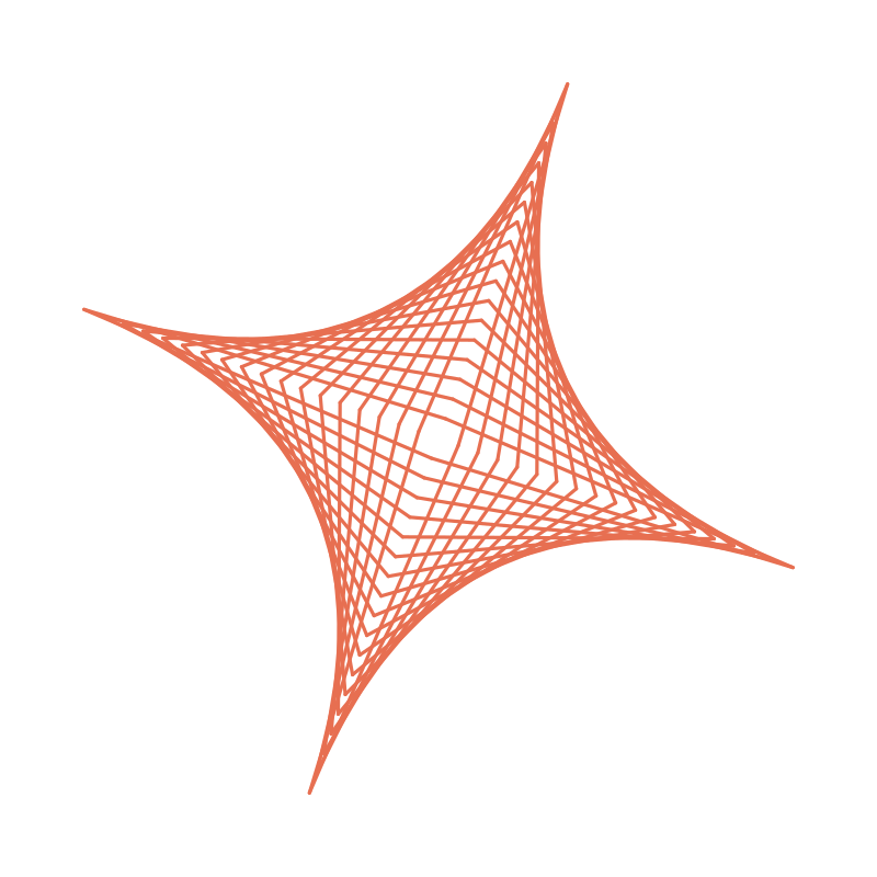
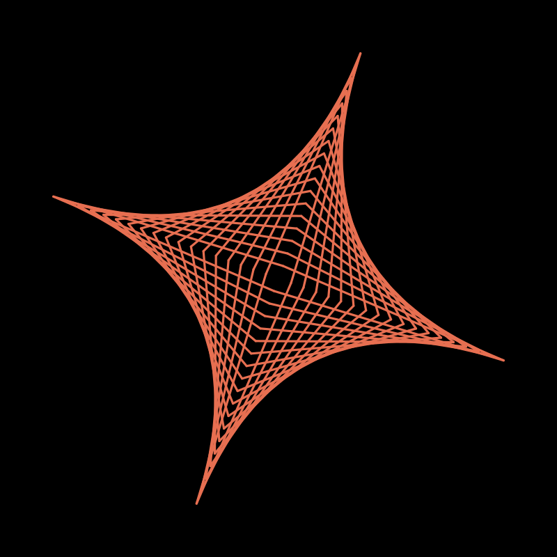
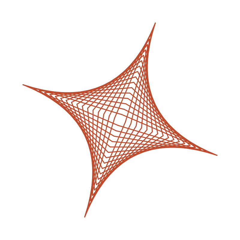
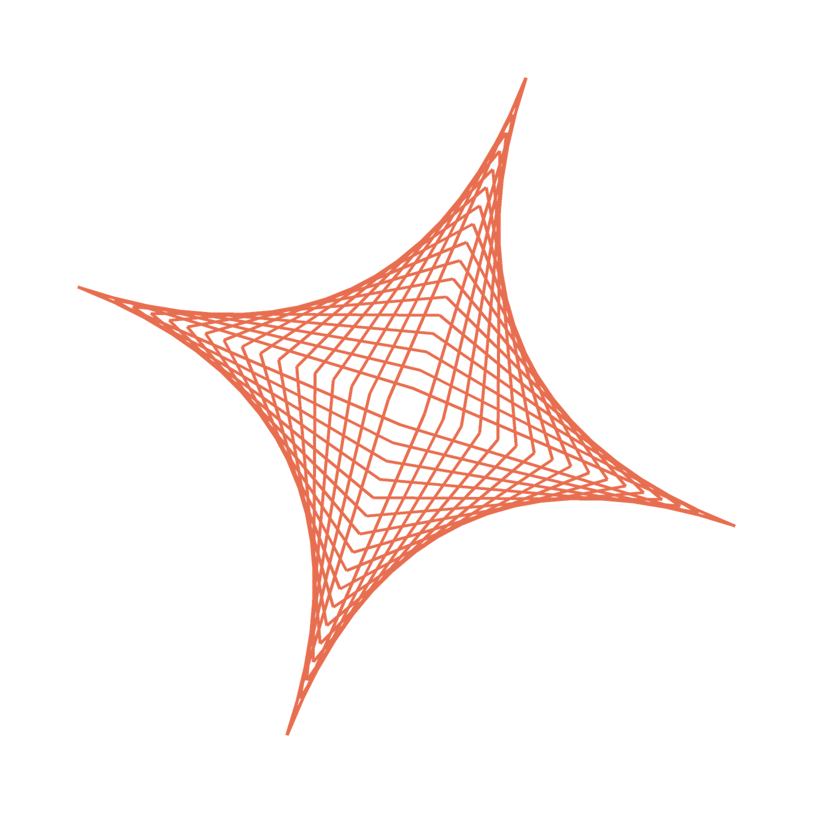
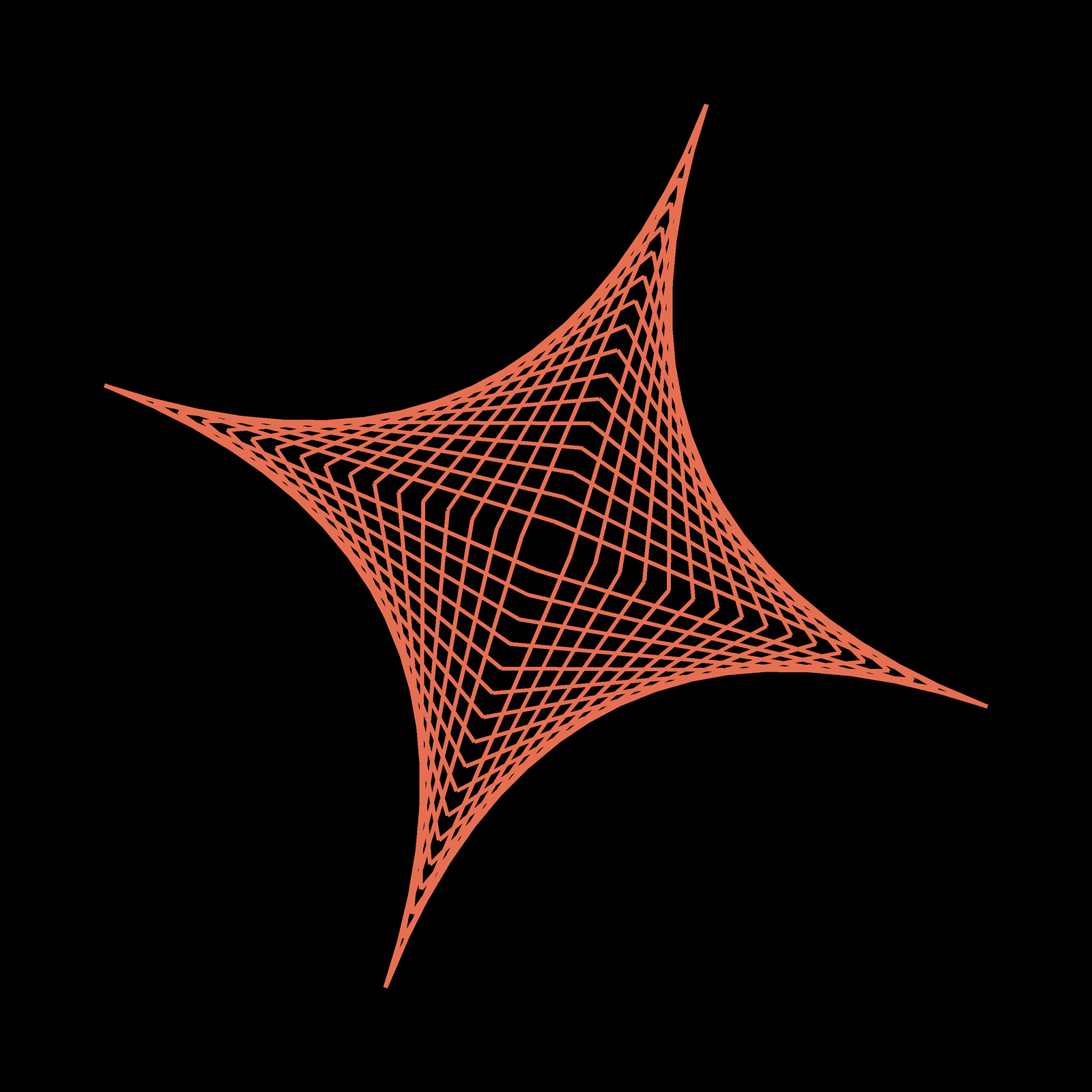
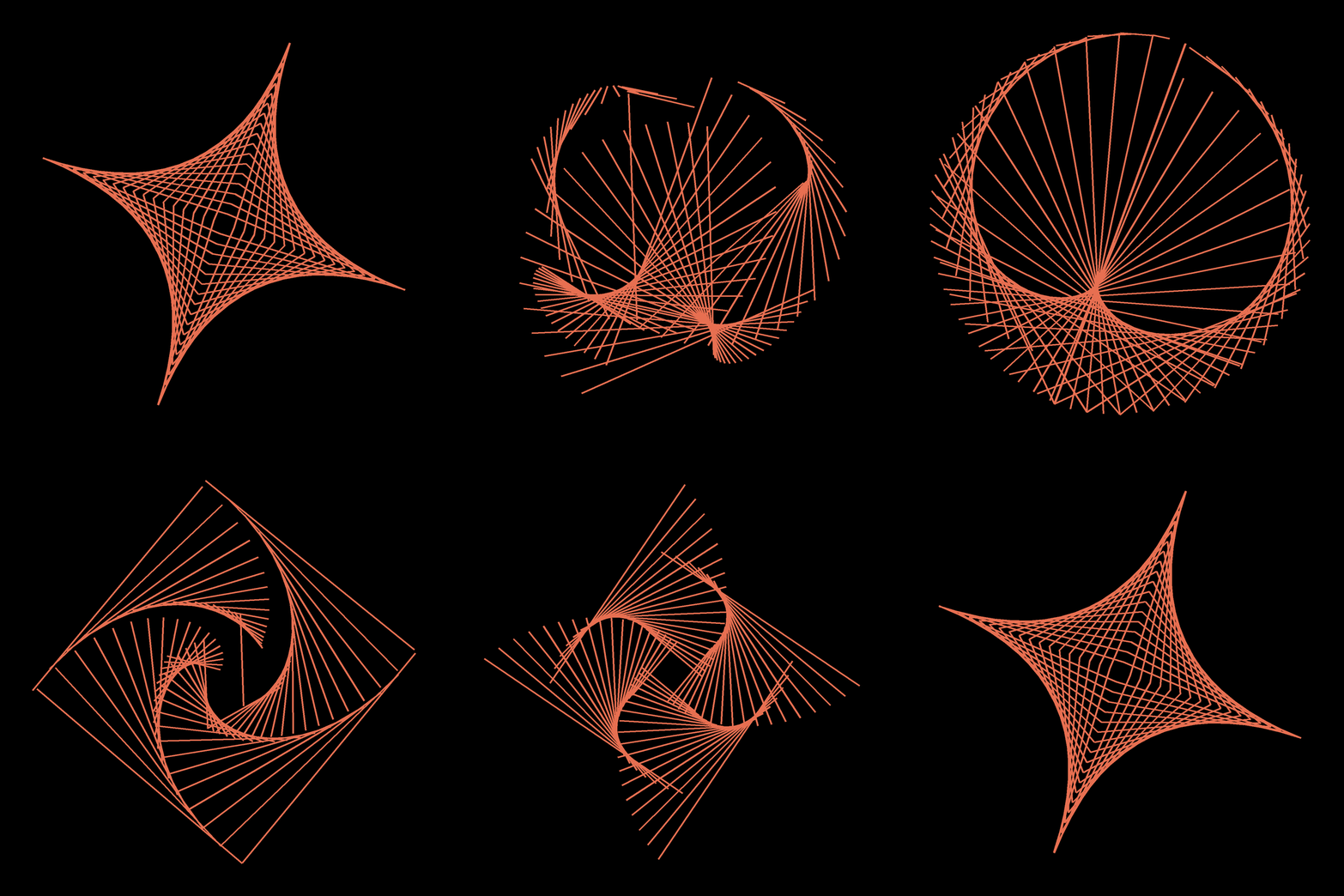
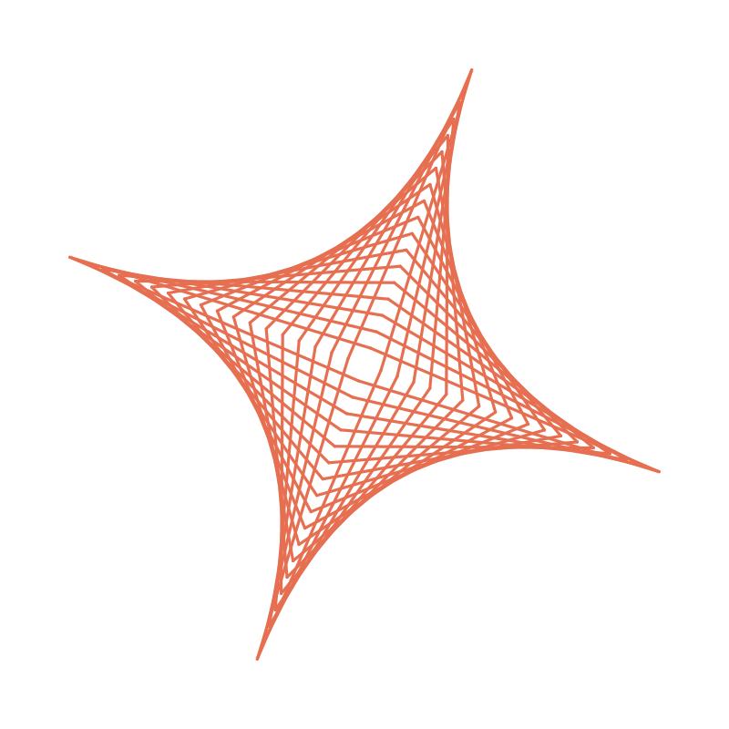
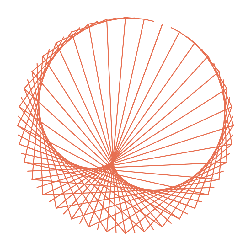
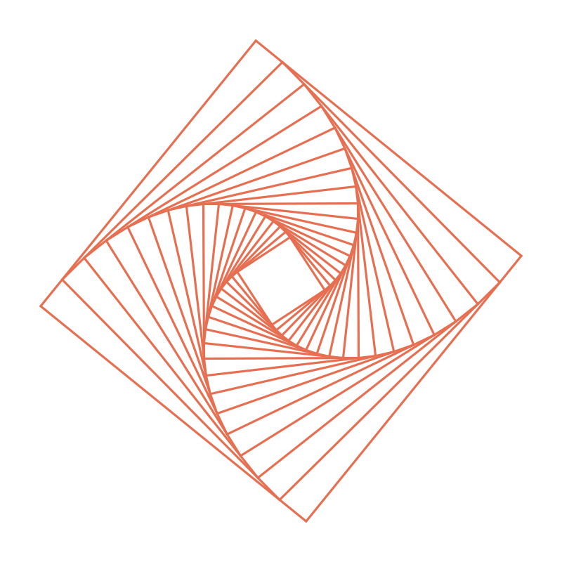
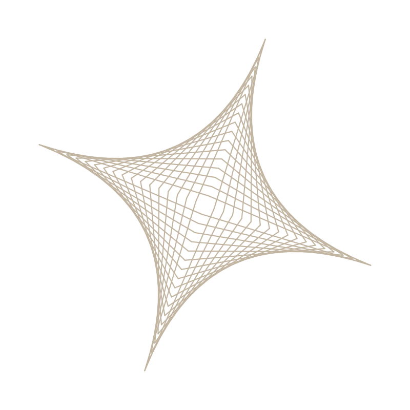
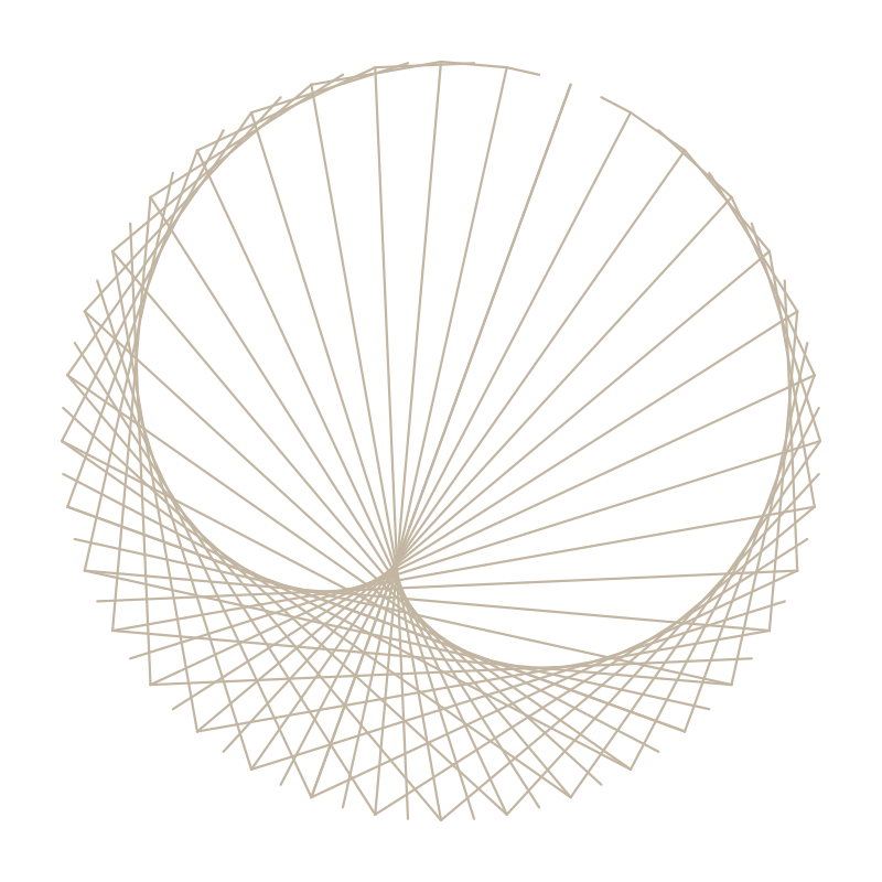
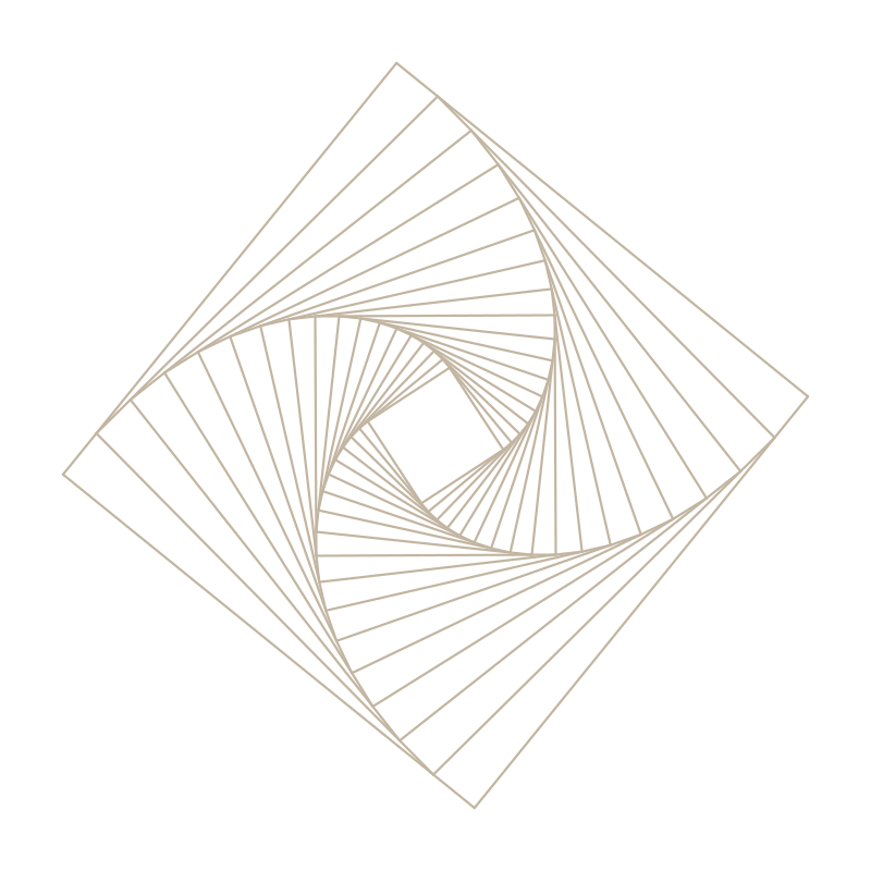
72 straight lines whose envelope reads as a curve. Connect them one way and you get a star; another way, a bloom; another, a spiral. The same simple elements, transformed by how they relate and a metaphor. That is what we share and teach people about AI; from something at harmony to purposefully chaotic to harmony again in different form.
The logo is the stitch star, tilted 20 degrees, in coral. But the full identity is motion: on the site the mark re-stitches between its canonical figures as you scroll. Frozen states each have a job.
#E76F51 on black; #BE4A2B on light grounds. Never outline it, never fill it, never add a container tile.assets/logo/, animated 800x800 loop included (MP4 + GIF).The ground is true black; on OLED the page disappears and the geometry floats. Warm ivory text, one loud coral, and the palette tints in reserve. Interactive text (links, and list-row titles on hover) warms to the coral accent #E9805E. Dark is the only surfaced mode; a light warm-paper variant stays dormant behind ?light as a print and forced-light fallback.
Supporting tints (sand #F4A261, sage #A8D5BA, teal #3B7A9D) survive from the light system for tags and gentle category color; sparingly, never as fields. Every text pairing clears WCAG AA (4.5:1); each hue has a designated ink for use as text; bright hues never set type.
The warm cast is a recipe, not a background color; this page uses it too. The base is pure #000000. Over it, every section carries a full-bleed wash at 5 to 6 percent alpha, alternating coral rgba(231,111,81,.05) and sand rgba(244,162,97,.06), melting to transparent at the top and bottom edge so sections blend instead of banding. That is the entire chocolate-espresso feel: true black doing the OLED disappearing act, with a breath of warmth where the eye rests. The light variant inverts it; a warm-paper base carrying the same two tints, fainter still. Raised elements on the black ground use these warm near-black tones, never a neutral gray.
Display · Inter bold · tight tracking (−0.02em) · line height ~1.06 · sentence case, always
Body runs in Krub at 17px with a 1.7 line height, warm and loopless. The eyebrow is the only uppercase in the system: 13px, tracked +0.08em, coral. No monospace anywhere; the system has no clinical register. Scale: 12 / 13 / 14 / 16 / 17 / 22 / 28 / 36 / 48 / 64 / 80.
No patterns, no noise, no stock. Background texture is the brand geometry at architectural scale: figures filling a full section and bleeding off the page, alternating sides down the scroll (right, left, right, left).
| Rule | Value |
|---|---|
| The skeleton (non-negotiable) | 72 lines · 18 rings x 4 arms · ring-major order · consistent rotation. Any figure honoring it morphs fluidly into any other. |
| Standalone vs field | Two treatments of the same geometry, picked by whether anything sits on top of it. Standalone (the animated mark, hero bands, exported loops, anything alone in its own frame) keeps full-opacity coral at the mark’s own weight; around 3.2px at the size it ships. Field (behind type, section backgrounds) drops to the values below. The 0.38 / 0.8px treatment exists to sit under text; with nothing on top of it, it disappears. |
| Field lines, dark | #E76F51 at 0.38 opacity, 0.8px non-scaling stroke |
| Field lines, light | #C2B5A1 at 0.5 (0.4 mobile) |
| Placement | Section-filling, off-page bleed, alternating sides; never centered as an object |
| Resolution | Figures hold fully stitched through their section; the morph (the messy middle) lives only between sections |
| Protection | Selection-style bars, background-colored, measured from real text line boxes, drawn under all text. Lines never cross a glyph. |
Where the field crosses text, no line may touch a glyph. The fix is a measured highlight layer, and it has five rules we learned by breaking each one:
| Rule | Why it exists |
|---|---|
| Bars are background-colored | Black on dark, white on light. They read as the geometry parting around the words, never as cards or panels. |
| Measure the text, not the box | Range.getClientRects() per element. A block element (eyebrow, label) reports full column width and would over-cover; the range hugs the actual glyphs. |
| Above the figures, below all text | The bars live on their own layer between the line field and the type. Wrong paint order and the lines cover the bars instead. |
| The layer may never inflate the page | Give it real height; a zero-height SVG is clipped in Safari and the bars vanish. Measure the document with the layer collapsed, and guard the resize observer on width so a height change can never loop the layout into infinite growth. |
| Paint the bars; never mask the figure | Do it by hand: an SVG layer of measured <rect>s, exactly as the homepage’s #hlayer does. A CSS mask-image cut from the same boxes looks equivalent and silently fails; the browser reads an SVG mask in alpha mode, so the “holes” keep the figure instead of removing it, and nothing in the DOM tells you. Every surface that puts type on the field (the event loops, the panel screen) carries this same layer; copy it, do not reinvent it. |
A placed figure is a master under a similarity transform, and nothing else. Everything the scroll sequence needs is three numbers per keyframe.
p′ = centre + scale × R(θ) × (p − (400, 400))
Applied to every line of assets/textures/fc-figure-*.svg, in file order. The file order is the load-bearing part: figures morph by interpolating line i of one keyframe toward line i of the next, so line i has to keep its structural role. The masters are authored on the shared skeleton and already satisfy that. Rebuilding a figure from its own construction does not, and the failure only shows up in motion.
| Rule | Why it exists |
|---|---|
| Place the master, never rebuild it | A regenerated cardioid (a monotonic sweep) and a regenerated star (four arms of eighteen rings) each look correct standing still and share no line order. Line i lands somewhere unrelated in the next figure, half the field swings across the frame, and the morph is spaghetti. The masters already hold the order. |
| Never translate an existing keyframe | Placed figures are full-bleed, wider than the viewBox. Sliding one sideways to a new centre pushes most of it off frame and it reads as a fan rather than a figure. Re-place from the master at the centre you want. |
| Decode with a similarity fit | Keyframes carry rotation. A scale-and-translate fit on a rotated keyframe reports error in the hundreds of pixels and looks like the line order is broken. It is not; the figure is turned. |
| Interpolate plainly | Given a shared line order, a straight cartesian lerp per endpoint is smooth. Reindexing, polar interpolation, and dissolve-and-restitch are all fixes for a problem that lives in the data, not the interpolation. |
Both directions are scripted: tools/place-figure.py place <figure> --scale --rot --centre emits a keyframe, and tools/place-figure.py decode <figure> --keyframe recovers the three numbers from one that exists, so an established composition can be reproduced exactly. The live homepage decodes to under a quarter-pixel:
| Keyframe | Figure | Scale | Rotation | Centre |
|---|---|---|---|---|
| 0 | star | 2.1976 | 0° | 1040, 380 |
| 1 | cardioid | 2.2095 | −20° | 300, 460 |
| 2 | pursuit | 2.2893 | −20° | 1310, 390 |
| 3 | star | 2.7209 | −40° | 420, 450 |
Sides alternate down the scroll, right, left, right, left, and the sequence itself is free: the lightning talk page runs cardioid, pursuit, star, cardioid on the same centres.
t*1.18 − (i/72)*0.18, smoothstepped; figures dissolve leading-edge-first and re-stitch the same way.prefers-reduced-motion: snap between resolved figures; never animate.Warm, plain, confident; a small gathering run by people with taste. Sentence case everywhere. Digits when functional: 120, 5pm, 2026. Say less; one idea per section, air around each. "We" for hosts, "you" for the reader. No em-dashes, ever; commas, colons, semicolons, periods.
Avoid: corporate SaaS, startup pitch, transit dashboard, design influencer energy. No buzzwords, no exclamation marketing, no emoji.
Every gathering is a numbered volume with its own theme title: Vol. 03 · Designing with AI. Field Notes issues mirror the volume numbers; the event and its recap are two halves of one object. Archive rows lead with the volume; dates ride trailing. A past volume is marked Complete in the lead column, eyebrow style in tertiary ink, never in the row title; the eyebrow is the only label style and titles stay sentence case.
A row carries one of three states, and only one of them is colored. The volume the hero is currently advertising takes coral on its number, and it is the only coral in the list; completed volumes recede instead, title to secondary ink and supporting line to tertiary, beside the Complete marker; anything upcoming but not yet the headline sits at full strength in neutral ink. The coral moves forward when the hero rolls.
Coral marks what a reader can act on now, so it never lands on Complete: spending the accent on finished events makes the loudest moments in the list the ones nobody can attend, and coral uppercase with tracking reads as a live eyebrow rather than a status. Nor is an already-tertiary element faded to signal state. The volume number and the date on a past row stay at full tertiary; at 72% they measure 2.82:1 against paper, under AA for 14px, and the date is information. The title carries the recession.
Photography is documentary: real rooms, real people, no stock and no staging. It arrives at mixed aspect ratios, so the layout adapts to the frame rather than cropping every frame to fit the layout.
object-fit: cover, so the rhythm stays even without forcing the wide frames.14px. No border. Elevation is --shadow-md on hover with a 1px lift, same as the button.The instinct on a true-black ground is to outline every photo. Measure first: sample the mean luminance of the outer 6px on each edge. Above ~40 the frame separates on its own and a border is chrome the guide does not want. Below ~40 on a given edge, that one image may take a --dark-border hairline. Ten photos were measured for the Vol. 02 recap; one edge on one photo qualified, so the run ships borderless.
JPEG, mozjpeg at quality 80, 4:2:0, progressive, metadata stripped. Three widths per photo, 800 / 1200 / 1600, wired with srcset and a real sizes string so no frame is ever upscaled at 1x, 2x, or 3x. Name by volume and story order: vol-02-01-full-room-800.jpg. Always set width and height; the highlight bars measure real line boxes and lazily-loaded images without reserved space move the layout underneath them.
An overlay (the photo viewer, any future modal) is always a dark surface, so it pins the dark tokens rather than inheriting the page's. Inheriting puts light-mode ink on a black ground the moment someone opens ?light.
.93 with a 6px backdrop blur. No blur under 900px, house rule; raise the ground to .97 instead.script-src 'self' and blocks the CDN. In production: x, chevron-left, chevron-right. Reuse these three rather than introducing new glyphs.Download the full asset pack → zip · instructions + tokens + components + logo + textures · ~11 MB
The pack ships with GIVE-THIS-TO-YOUR-AI.md. Paste it into whatever you build with, alongside the SVGs. It carries the skeleton rule, the placement formula, the two stroke treatments, the content-protection contract, and the reference composition, so an assistant can generate any figure, any in-between frame, any size, and get it right the first time. The pack also ships the token files and place-figure.py, so the values it quotes can be read rather than retyped. It also carries the recipe for the animated loop, so any starting figure or length can be rendered rather than shipped as another file. The eight core components come with it, so a page built from the pack gets our buttons and inputs rather than invented ones.
It leads with the mistake everyone makes: regenerating a figure from its own construction instead of placing the master. That looks correct standing still and turns to spaghetti the moment it moves.
fc-mark.svg (coral, transparent) · fc-mark-on-black.svg · fc-mark-light-bg.svg (#BE4A2B for light grounds) · fc-mark-1600.png · fc-mark-black-1600.png · animated 800 MP4 · animated 800 GIF
star · cardioid · pursuit (coral) · star gray · cardioid gray · pursuit gray (light mode)
All assets derive from the shared 72-line keyframes; request any figure, any in-between frame, any size.
Frontier Creatives · frontiercreatives.design · assembled with the messy middle fully visible.